


Interiors and product, shaped by the same design approach
Studio Atkinson brings together interiors and product within one considered approach. Furniture, lighting, textiles, wallpaper and accessories are developed in house, informed by years of interiors practice and a deep understanding of how people live.
Each piece is designed with clarity and care, with a focus on proportion, material and detail. Created to sit comfortably within a range of settings, the collection reflects the same warmth and quiet confidence found across the studio’s interior work.
Featured Collections


Susie Atkinson Interiors
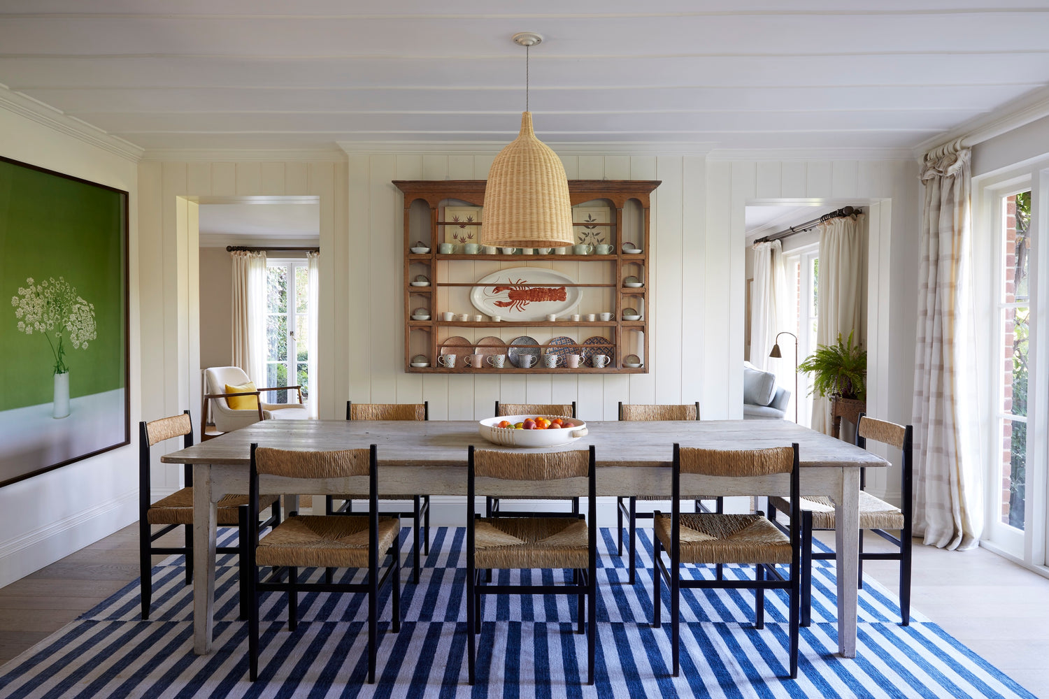
Pair text with an image to focus on your chosen product, collection, or blog post. Add details on availability, style, or even provide a review.

Commercial Interiors
A portfolio of commercial interiors designed with clarity and care, shaped by material, proportion and a considered understanding of how spaces are used.

Residential Interiors
A portfolio of residential interiors shaped by how people live, brought together with warmth, balance and a close attention to material, proportion and detail.
Journal

Laid Bare: A Collection Shaped by Craft, Simplicity and Enduring Design
Born from years of designing interiors, Laid Bare is Studio Atkinson’s founding furniture collection. Explore the thinking behind the designs, the craftsmanship that defines each piece and the enduring philosophy that continues to shape the collection today.
Learn more
Studio Atkinson’s first printed fabric collection – the Woodland Rose
After over a year in development, we are delighted to introduce our first printed fabric collection, Woodland Rose. We often found that florals either felt traditional and decorative, or distinctly feminine. We wanted to create something that bridged this gap – a fabric that could move effortlessly between settings, and could feel smart and masculine in some contexts, or soft and feminine in others, depending on how it is used and the colourways chosen. To achieve this, we carefully and deliberately balanced the floral motif with an equally weighted stripe, and introduced bold colours to the striped part. This brings strength and structure to the design which helps in balancing the femininity. Likewise, the colour combinations were chosen to feel slightly unexpected, adding interest and a subtle tension that keeps the design from feeling overly decorative and helps to temper the “prettiness” of the floral. The collection is available in six colourways and is printed in England on a beautiful 100% linen cloth. We have already had great success with using Woodland Rose across a number of projects; for curtaining, headboards and upholstery – and more recently, paper-backed it in the Tobacco & Rust colourway and used it in a men’s study which looked absolutely fantastic!
Learn more
Atmosphere Comes First
Before any object is placed within a room, there is a sense of how it should feel. It is often difficult to define precisely, yet it is immediately recognisable. A space may feel calm or uplifting, warm or restrained, even before its details are fully understood. This underlying atmosphere is what gives an interior its presence. It is not created through decoration alone. Atmosphere is shaped by a combination of light, material and proportion, working together quietly. The way daylight moves across a surface, the softness of a textile, or the depth of a wall finish can influence how a room is experienced far more than any single piece of furniture. Light plays a central role. Softer, diffused light tends to create a sense of ease, allowing materials and colours to settle naturally. In the evening, a more considered approach becomes important. Low level lighting, placed with intention, brings a different quality to a space. It allows certain areas to recede while others come forward, creating a sense of depth and calm. Material contributes just as much. Natural surfaces carry a variation that feels instinctively comfortable. Timber that has been worn over time, linen with a slight irregularity, or stone that reflects light unevenly all add to the overall atmosphere. These qualities are subtle, but they shape how a room is perceived and how it is lived in. Colour is often approached in a similar way. Rather than making a statement, it tends to support the overall tone. Softer palettes can create continuity between spaces, allowing movement from one room to another to feel unforced. Even where colour is used more confidently, it is grounded through material and light, so that it sits comfortably within the space. There is also a relationship between atmosphere and restraint. When too many elements compete for attention, the overall feeling can become unsettled. Allowing certain pieces to stand back creates space for the room itself to come forward. This balance is not about removing character, but about ensuring that it is experienced clearly. The influence of place often sits quietly behind these decisions. A landscape, a coastline or even the quality of light in a particular location can inform the direction of a scheme. These references are rarely explicit, yet they shape the palette and material choices in a way that feels natural rather than imposed. Atmosphere is not something that can be added at the end of a project. It is present from the beginning and develops through each decision that follows. When considered carefully, it allows a space to feel composed and enduring, rather than finished too quickly.
Learn more